Showing posts with label walk-through. Show all posts

Wednesday, July 30, 2014

Mayflower Process: Vilnius Aflame


The first spread of the first issue of my first original series was... important, to say the least. After an opening page full of dialogue and vague shots of a city through clouds, I needed to grab the eye of the readers as well as give them some space from dialogue but at the same time make sure they see the explosion that was happening on the page. That explosion subsequently leads to the events in the following pages so it needed the highest attention, but at the same time, needed to be somewhat withdrawn so the rest of the scenery could be soaked up and the comic didn't say "Look, explosions - great, huh?"


I thought using 'letterbox' bars would create that panoramic view I was going for, as well as a cinematic one, which often doesn't hurt. It adds a focus, it sets the table. The black is the basic canvas in a way- it's what happens when you don't make art, so it brings attention to what is there and makes it seem important. At least, that's one idea. Maybe it's just because we have the black bars so associated with films that we just expect it to mean some benchmark of quality.

Either way, I began with some soft morning colors. I quickly blotted some cloud rolls in to show me how high these spacescrapers were going to be. I also started to play with different building designs.


Here you can see some of those buildings getting detailed. The tallest building on the right had already received its design years ago in sketchbooks as I came up with this universe. It's the District Control tower and it's shape is iconic to the Mayflower story. Especially because it's the one that gets blown up.


But the problem with all that art was: I hated it. I started again almost completely from scratch and set up a much more interesting cloud system. I was worried about the sun, as when I would eventually get to that said explosion, and it would be competing with it. So I kept it subdued for now. Eventually I'd add a few freckles of intense white where it breached the cloud line.

It was also at this point in the creation of the comic that the beginning sequence switched to dusk as opposed to dawn, for various story and visual reasons, hence the much darker image.


Re-inserted the District Control tower here and began adding flying transports to give the composition scale and flow.


This can especially be seen once I got to the engine glows and trails, and began to add in more details across the whole image. The little bridges and suspension structures in the mist really helped it feel expansive and interconnected.

The explosion itself was fairly easy, but towards the end of it you have to find that perfect balance of contrast to make the explosion look active and dangerous without making the colors just white and orange. There has to be some gradation in there or else it's simply not very pretty to look at it. That's a mistake I was making across all my art not long ago.

You can also see above that the letterbox bars became slightly transparent and grabbed hold of the title text for the story arc. This version was used for the preview edition of issue #1. 


After extended viewing, I wasn't quite happy with it and had the opportunity to revise it for the release of the full issue. As I said, this image was more important than almost all of the other pages, so it required my obsessiveness.

I detailed the ships a bit more, tweaked the fireball, and added more convincing sun glares on the metal and glass buildings. You can also see that tweaked sun that I mentioned above. The sun also go its own ray of light heading down between the farthest clouds to add another diagonal to move your eye around the pages.

The clouds themselves had the most important revision. By simply becoming far more detailed, they were able to convey more scale to the image. These are massive, dynamic clouds, and these spacescrapers are breaching them. It needs to be impressive.

The transparent letterbox became white like many of the paneling frames of the full issue. White borders seemed to match the style and themes of Mayflower better, because of its association with optimistic, golden age sci-fi.


Here you can see the final pages with new, more subtle title text overlaid on the art.

_______

You can find out more about Mayflower and read this first issue for free at www.MayflowerComic.com.

Sunday, March 24, 2013

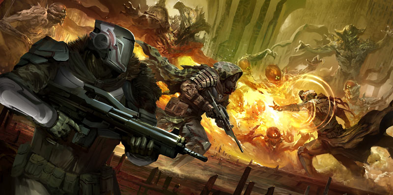
"Brothers In Arms" - Destiny Fanart Walkthrough


I've been working with Claude Errera (Louis Wu of Halo.Bungie.Org) and a great team on Destiny.Bungie.Org, a fansite dedicated to Bungie's new IP, "Destiny".

I pitched the background and basic design of the site. They'll be more to it in the future as we learn more about Destiny.

Lately I was tasked with creating a background for the DBO Twitter feeds the staff was readying. My first step: procrastinate and work on other things.

... After that, though, I sat down and got my butt into gear. I was going to be out of town in a few days and I wanted the piece done by then so that the Twitter-addicted Mr. Errera could have his account as soon as everything else was prepared.

1.

I started sketching, obviously inspired by the amazing concept art Bungie has posted, especially this piece and this piece. I was also trying to think in terms of a Twitter background; since the center would be obscured, I would need the best parts of the picture on the left and right.

2.

Originally, I was just going to do this piece in black and white and match the news sketches I've been doing for the front page. "Fast and easy" and then I could get onto other things. But then, logically, I made it a hundred times harder and started playing around with colors.

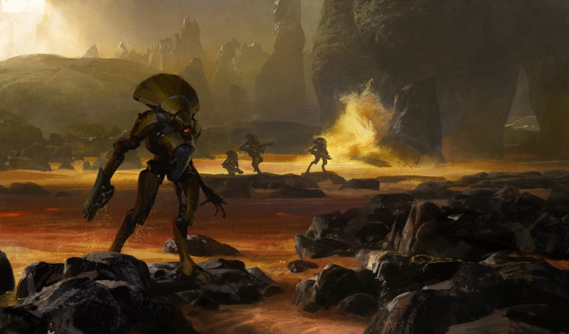
I got rid of the good-guy in the middle and replaced him with more incoming Vex robots. I also moved away from the ship graveyard I was imagining in the original sketch's background and towards a Martian volcano (not sure if it really ended up in Mars...).

One thing I stressed upon myself was to work more (and more unexpected) colors into my landscape that would still look natural - and thus make the piece more interesting to look at in the end. You'll notice blues and purples in the dark side of the mountains as evidence of this attempt.

3.

I continued solely on the background for a while. I find it relaxing to paint happy mountains, rivers and waterfalls and it's one thing I consider myself decent enough to the point where I'm not constantly criticizing every move I make.

I smudged the clouds with my custom brush, added cracks and highlights to the nearby rocks, and enjoyed playing around with where the lava-falls would carve into the mountainside.

4.

I switched back to the characters and had a lot of fun fleshing out the Vex on the right. The action and posture from the initial sketch yelled 'drama' so I tried hard to not kill that as I laid the digital paint atop it (I also don't always capture that kind of action in my non-comic art so I'm trying to get more of that dynamic movement in my concept pieces these days).

Some laser blasts were added on the left for more diagonals to draw your eye in. I started experimenting with colors and new designs for our left hero. He started to look a little like a Carter/Jun hybrid! :)

5.

Continued to design-as-I-painted this attacking (or fleeing?) soldier as well as carve out the background Vex. The soldier's gun started to pick up some of Halo's assault rifle but I thought the bayonet and extended barrel would pull it away from that.

6.

More work on the left soldier. Hard to see in this format, but I also shrunk him down a bit.

7.

Here I made the middle Vex bigger, trying to create a better rhythm for your eyes (I went back and forth a lot on this - I eventually made him smaller in the latest version).

The left soldier also received a nice heap of texture and scratches on his armor at this point. His weapon grew a number of crooked wires which at first seemed strange in my mind's eye but as they were implemented I fell in love with them. I'm going to be using them on more of my artwork, I can guarantee you!

I also tried to bring his cape to life at this point and got distracted for a while by trying to melt the rocks directly behind him on the left. I think it might have worked...

A moon was dropped in above and I added a few spaceship/missile trails to help it feel like more of a battle.

8.

By this stage, it was late into the night before my trip and in a few short hours I needed to drive to St. Louis. After a few more refinements, I spent an hour or more tweaking the levels and colors of the entire image (I can get stuck in this stage for way too long). The main thing I settled on was an orange filter to 'heat' up the piece. I uploaded the piece to DBO_tweets and fell asleep.

9.

The artwork had been posted for a week, but I was looking at it again the other day and found myself dissatisfied. It felt too washed out in some areas and too dominated by the orange filter in others (although I did like the 'heat' of it).

Hesitantly, I worked more purple into the background and covered our closest soldier with a rough coat of blue paint. I also shortened his gun's barrel and elongated the bayonet to make it more practical.

I also refined a number of little things here and there across the piece that I probably didn't need it and were completely impossible to see by the viewer... I have a problem with doing that!:)

Then, today I looked at the piece again. I was happy with the changes...

But it needed more damnit!

10.

Here's the final piece (At least, that's what I'm saying right now).

I kept the heat of the orange but tempered it with lighter and cooler colors at the top (I especially liked how the blue drifted in on the top-right). I also redrew some of the cliffs in the middle as well as our hero on the right (almost completely).

I pushed the middle Vex further back and changed the posture of his arm a bit to make him seem like he was reacting to the scene instead of motionless. I also motion-blurred the right Vex's flying, dismembered arm as well as the rocks he was knocking off the sinking boulder.

The hero on the left received more contrast to make sure he was the first thing you see and to make sure he appeared closest to you. I blurred the entirety of the background just a hint as well.

Happy for a few brief moments, I quickly saved and ran away to something else!

Thanks for reading all the way down. :)

Sunday, July 3, 2011

Anubis, the Comic Book....


I'm in the throes of illustrating the first issue of the comic book "Anubis" from creator and writer Sage Howerton.  (The final cover is shown on above.)

"As the sun sets on the Bronze Age a dark shadow hangs over the gods of ancient Egypt. The mysterious and inexplicable death of the goddess Bast has disquieted her immortal brethren. Lurking in the shadows is a force not of this world that even most gods could not stand against. Only Anubis, god of death, can hope to balance the scales in the millennia to come..."

Every interior page has been thumbnailed and laid out and now I'm diving into fully rendering each page.


You can see from these images the process of jumping from those initial rough marks to the final interior art, full of texture, color, and life.  I hope, at least. :)


And here's some more promotional art that features the title character, Anubis.  His costume and staff has evolved a little since this pic.


Check out the latest updates on the project at Facebook.com/Anubis.Comic

Sunday, February 13, 2011

Commission Cross-section

Bry of Virtuous Sanctum commissioned me to do a special piece for him and his friends, depicting their created Elite/Sangheili characters from the Halo universe.

After getting the idea of what the piece should be worked out with him, I started sketching thumbnails, eventually getting an approved shot like this:


Where the Elite aliens are gathering together one last time before shipping out to war.  Alien spacecraft are launching in the background to head to the front lines.

I created the background when I had sometime, before heading into the harder work of the characters themselves.


Some time passed before getting back to the piece, and when I did, I felt that the shot was too far drawn out to really capture the emotion of the characters - the most important part of the piece.  So I cropped in close, stretched out the background to fit, and started reworking it.  I sketched the Elites out first on paper with pencil, then scanned it in with my large-format Brother MFC-6490CW (college graduation present-boy is it helpful!).  Here you can see the piece with some base colors thrown into the sketches.


After getting some feedback from Bry, I revised a bit and then started in with the details, trying to perfect every centimeter of the piece, from really rendering the characters to detailing the background and the spacecraft.


I'm particularly found of the sky.  It turned out beautiful, I think.  Definitely not what I had started out trying to do - it just happened in the process.

Here's a little experiment.  I created a basic little video to show the rough draft fading into the final piece...


Sunday, September 26, 2010

The making of "It Will Never End" - rejected illustration for Ubi Workshop's Art of Assassin's Creed.

So the prompt said basically to create your own assassin within the Assassin's Creed - the rest was up to you.  Any time period, any style, any medium, etc...

I decided upon crafting a near-futuristic (is that a word?) assassin.  Now, I figured a futuristic version might be popular, very popular.  But the execution of a piece of art is just as important as the initial idea, right?

So i opted to do something subtle.  No giant cities and flashing colors or giant mechs.  Just a hologram HUD and an electrified blade, with the real time and setting to be interpreted by the viewer.  Give it a bit of mystery and keep the viewer engaged (like making them have to read the text backwards to figure out what it says).


I started off with a rough sketch and fell in love with the idea (first idea included said 'gaint cities and flashing colors or giant mechs')


Then I broke the piece down and deleted the Googled lightning I had used as a placeholder.  I'm mostly just using a custom brush here to smudge the hell out of everything.


Really worked hard to capture a realistic likeness using a custom smudge brush, some thinner brushes for the hair...


...and some spotted brushes to add in some skin texture.  Started adding in some color as well so I could start to figure out its affect on the piece.  I was trying to create an assassin with a darker skin color... but with all the reflections and lighting that came later, that was kind-of lost.


The hologram was a lot of fun to do.  Used a number of built-in Photoshop filters on colored shapes to give me the effect I wanted.


Painted in his glove.  Looks really strange and doesn't fit at the moment so...


... I added shadows and details and highlights to immerse it within the work.  I also added the electrified blade and tweaked the whole image.  A scan of a sheet of paper that I wiped ink across in various ways was used atop of everything to give some slight texture to everything.  And it's done.

And then two months later, rejected! Hah.

Here's a link to the piece on DeviantArt, as well a shot of all these in-progress pics laid out next to each other.

Friday, September 3, 2010

Evolution of "Virgil"

Here's a couple of comparison shots to show the progress of creating the Virgil character design, highlighted in the last post.

Sketching randomly led to an interesting portrait that seemed to work for a character from something I've been working on.


I then started on a more polished character design piece that would have a close portrait and a full-body design next to it.  He grew a bit younger as I worked on it.


The full-figure was fun to do, with a lot of temporary layers here and there that demoed wild and weird ideas as I worked on him (think that shoulder plate on the left, but all over).


And altogether...


Tuesday, August 24, 2010

Commander Gloop!

Another piece of art for TGB Customs packaging!  Continuing with the theme of doing these like a horror movie poster, like the 'Mammoth Monster' before...


After some feedback from TGB Customs, color started to work its way in.


And then I finished rendering...


This was a blast to do - especially the glowing Dr. Brain!

Wednesday, August 18, 2010

The Mammoth Monster

Another illustration for one of TGB Custom's figures, this time the Mammoth Monster.


It started life as...


And quickly grew into the troublesome teenage years...


Until finally reaching adulthood and moving out of the damn house.


Though it did leave behind some of it's innocence.

Monday, August 2, 2010

Halo Evolutions Art Contest Entries

The contest deadline just went by a couple of days ago, so I thought I should post my entry, and (sadly) the non-entry (since I discovered that I could only enter one piece) and a bit about how they came to be.

Illustrating Tobias S. Buckell's short story, "Dirt", I started with the linework below (after a few sheets of thumbnails):

The piece shifted drastically after I had scanned the original image in.  I didn't like what I had, so it became far more dramatic and grasped a much more oppressive tone.


Lot's of tweaking in the final stages - this period seems to be the big time-consumer in all my pieces.


And the final piece:


For B. K. Evenson's "Pariah", concerning a failed, tortured super solder, I came up with a much less dramatic and exciting piece... but also a much more subtle and conceptual one.


And to give it a bit more flair...


I stared at the two finished pieces for weeks, asking everyone I knew what they thought.  In the end, I went with Pariah, mostly with just a gut feeling... Hopefully I chose wisely, but I still keep imagining the old knight from the end of Indiana Jones and the Last Crusade saying "You chose poorly."