Tuesday, November 23, 2010

"Learning to Fly" Character Design


Here's a character design piece I made for AnimationRigs.com 's "Master and Student"-themed contest.

Started off with doodles and fond myself in a funny mood (nice to change pace from all that dark, devil-worshiping art I usually do).  Came up with an old geezer being taught to fly by a wickedly cool old bird.


I started painting a background and got to the great point where I loved it so much I didn't want to put anything on-top of it... but alas...


Came up with some poses that seemed dynamic but also straightforwardly describing the figures - since it is a character design after all, and not a 'standard' artwork.  These started out as pencil sketches that were scanned in and colored (like a coloring book!).


And the final step:  Take forever finishing it up and tweaking every detail until you can't even tell what you've done to the piece for the last 20 minutes - that's the sign to STOP.

~Here's a link to the DeviantArt post:

Saturday, November 6, 2010

Halo: Evolutions Volume One, available now.


Click to go to its spot on Amazon.

This pocket-sized edition of Halo: Evolutions features an illustration of mine for B. K. Evenson's short story "Pariah."  If you like sci-fi or Halo, check it out in book stores everywhere.

Wednesday, September 29, 2010

Art Recap: September

Here's a recap of recent work that's gone up around the internet in the last month.


"Back to Work" - Concept art


(Originally posted here.)


"Sigrid Svard" - Character Portrait


(Originally posted here.)


"Volley!" - Illustration


(Originally posted here.)


Apparently it was a green month.  Hmmm.


Alright... now it's really 'back to work'.

Sunday, September 26, 2010

The making of "It Will Never End" - rejected illustration for Ubi Workshop's Art of Assassin's Creed.

So the prompt said basically to create your own assassin within the Assassin's Creed - the rest was up to you.  Any time period, any style, any medium, etc...

I decided upon crafting a near-futuristic (is that a word?) assassin.  Now, I figured a futuristic version might be popular, very popular.  But the execution of a piece of art is just as important as the initial idea, right?

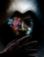
So i opted to do something subtle.  No giant cities and flashing colors or giant mechs.  Just a hologram HUD and an electrified blade, with the real time and setting to be interpreted by the viewer.  Give it a bit of mystery and keep the viewer engaged (like making them have to read the text backwards to figure out what it says).


I started off with a rough sketch and fell in love with the idea (first idea included said 'gaint cities and flashing colors or giant mechs')


Then I broke the piece down and deleted the Googled lightning I had used as a placeholder.  I'm mostly just using a custom brush here to smudge the hell out of everything.


Really worked hard to capture a realistic likeness using a custom smudge brush, some thinner brushes for the hair...


...and some spotted brushes to add in some skin texture.  Started adding in some color as well so I could start to figure out its affect on the piece.  I was trying to create an assassin with a darker skin color... but with all the reflections and lighting that came later, that was kind-of lost.


The hologram was a lot of fun to do.  Used a number of built-in Photoshop filters on colored shapes to give me the effect I wanted.


Painted in his glove.  Looks really strange and doesn't fit at the moment so...


... I added shadows and details and highlights to immerse it within the work.  I also added the electrified blade and tweaked the whole image.  A scan of a sheet of paper that I wiped ink across in various ways was used atop of everything to give some slight texture to everything.  And it's done.

And then two months later, rejected! Hah.

Here's a link to the piece on DeviantArt, as well a shot of all these in-progress pics laid out next to each other.

Sunday, September 19, 2010

Larvoid Follow Up


From a post a few back, I featured my Larvoid illustration for TGB Customs.  Well here is one of the actual figurines with the artwork on its packaging!  Very cool!

Friday, September 3, 2010

Evolution of "Virgil"

Here's a couple of comparison shots to show the progress of creating the Virgil character design, highlighted in the last post.

Sketching randomly led to an interesting portrait that seemed to work for a character from something I've been working on.


I then started on a more polished character design piece that would have a close portrait and a full-body design next to it.  He grew a bit younger as I worked on it.


The full-figure was fun to do, with a lot of temporary layers here and there that demoed wild and weird ideas as I worked on him (think that shoulder plate on the left, but all over).


And altogether...


Tuesday, August 24, 2010

Art Recap

Here's a recap of recent work that's gone up around the internet.

"Fires, Still Burning" - Concept art / matte painting practice

(Originally posted here.)

"Virgil" - Character design

(Originally posted here.)

"Watchful Protector" - Batman fanart, experimenting with using Google SketchUp to aid in the art process

(Originally posted here.)

"Cyclops" - X-men fanart

(Originally posted here.)

You can now follow me on twitter, by the way.  I'll update it whenever I upload a new piece anywhere on the web.

Commander Gloop!

Another piece of art for TGB Customs packaging!  Continuing with the theme of doing these like a horror movie poster, like the 'Mammoth Monster' before...


After some feedback from TGB Customs, color started to work its way in.


And then I finished rendering...


This was a blast to do - especially the glowing Dr. Brain!

Wednesday, August 18, 2010

The Mammoth Monster

Another illustration for one of TGB Custom's figures, this time the Mammoth Monster.


It started life as...


And quickly grew into the troublesome teenage years...


Until finally reaching adulthood and moving out of the damn house.


Though it did leave behind some of it's innocence.

Monday, August 16, 2010

"You chose... Wisely." Halo Evolutions Art Contest Winner!


My 'Pariah' illustration, which I featured in my last post, won for its category in Microsoft's (specifically 343 Industries) art contest!  The winners get to have their art published alongside the short story that they chose to illustrate in a future edition of the Halo: Evolutions anthology, published by Tor.


So to recap:  my art will literally be featured in the New York Times Bestselling "Halo" series sometime this fall!!!


You can check out the news (and a winners gallery) on the official site here.

Monday, August 2, 2010

Halo Evolutions Art Contest Entries

The contest deadline just went by a couple of days ago, so I thought I should post my entry, and (sadly) the non-entry (since I discovered that I could only enter one piece) and a bit about how they came to be.

Illustrating Tobias S. Buckell's short story, "Dirt", I started with the linework below (after a few sheets of thumbnails):

The piece shifted drastically after I had scanned the original image in.  I didn't like what I had, so it became far more dramatic and grasped a much more oppressive tone.


Lot's of tweaking in the final stages - this period seems to be the big time-consumer in all my pieces.


And the final piece:


For B. K. Evenson's "Pariah", concerning a failed, tortured super solder, I came up with a much less dramatic and exciting piece... but also a much more subtle and conceptual one.


And to give it a bit more flair...


I stared at the two finished pieces for weeks, asking everyone I knew what they thought.  In the end, I went with Pariah, mostly with just a gut feeling... Hopefully I chose wisely, but I still keep imagining the old knight from the end of Indiana Jones and the Last Crusade saying "You chose poorly."

Thursday, July 15, 2010

Just Some Good Ol' Alien Insectoid Art

Click the pic for a large version of some art created for the packaging of TGB Custom's Larvoid figure.


Here's a direct link to TGBCustoms' blog and website.

Check back soon for more of the standard tutorial/in-process comparisons I've been posting.

Saturday, June 26, 2010

Wolverine: The Weight

This piece kinda came out of nowhere. Just started doodling with my tablet. Doing basic line art and then building on top of that with different greytones.


Deciding to take it farther, I threw basic color ideas up to begin painting. Very freeform; experimenting with different brushes -really just going all over the place..


Continuing what I did before, but starting to bring highlights and shadows out, as well as fixing things like the posture and face. Playing with the overall hues again to find a better balance, as well.


Throwing more texture in, as well as a filtered photo I took for the far background. I make sure and paint all over it and bend it to my will, so it doesn't feel just Photoshop-ed in.


I do the same for the dirt by his feet. And then more tweaking... more finishing... more everything... and I'm done. And then I add the trickled of blood that makes the whole piece!


And then I had a little fun with a logo version.